As a company specializing in UX research, we are accustomed to helping clients improve their user experiences, but what happens when the users are us and the client is also us? Well, you get some meta geek-out moments.
Back in the “before times,” Centralis worked in person, ran studies in person, and had in-person processes. Now, we work remotely, run studies (mostly) remotely, and have remote processes. A lot has changed over the years - except for our internal filing system. So, when a team member recently searched for a file and came up empty-handed, we realized it was time for some good ol’ UX research. Read on to see how we pulled tools out of our own UX research toolkit to make things easier for our staff.
Question #1: What Have We Got?
Our first step was to generate a content inventory, which required an archeological excavation of the dusty (digital) filing system. While creating a content inventory for a large experience can be intimidating, it’s a critical first step that pays out in spades later in the process. The act of reviewing and cataloging your content gives you a clearer understanding of your strengths and gaps in meeting users’ needs. It also helps you find outdated materials that are ready for retirement, which makes your organizational task all the easier.
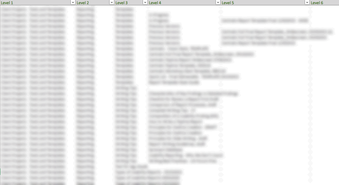
After many hours, a few Excel sheets, and one lawn mower consent form, the Centralis team emerged from our knowledge management system with a complete inventory of files and folders dating back as far as 2001. Some items were fit for a UX museum, while others were long-forgotten jewels, ready to be shined up. Indiana Jones would be amazed.
It’s blurry on purpose, for confidentiality. But even not blurry, it made our eyes cross.
Step 2: So How Should We Organize It?
Based on our previous personal experience using the filing system, we generated some hypotheses how we could better organize our files to meet our team’s needs. We then chose a set of items from our inventory that could confirm, deny, or suggest a different system altogether. From there, we set up a card sort study to find out how each team member would organize the files we selected. This involved creating between 20-40 ‘cards’ with descriptions of actual files within our system and asking team members to group them into folders that they would label. Given that we’re at team of UX researchers, we didn’t have to probe our participants too much to get them to speak their minds😉
A (blurred) excerpt from one Centralien’s card sort
Once everyone on our (small) team had completed a card sort session, we synthesized the results, looking for patterns within the groupings people created and how they labeled them. We employed a quantitative analysis method called hierarchical cluster analysis to created a dendrogram that visualized the relationships among everyone’s sorts. With these artifacts in hand, we put on another vat of coffee, brought our quantitative and qualitative data together, and began to iterate on a new information architecture for our files.
A dendrogram, illustrating the clusters created by all participants’ sorts
Chapter 3: Did We Get It Right?
When we had accounted for patterns, groupings, and raw data we were ready to launch a tree test for our proposed internal filing structure. This step entailed us building out the structure of our internal architecture with folders and subfolders and creating tasks to assess if our proposed file locations matched our team’s expectations. While we normally run unmoderated tree tests using tools like Treejack for large representative samples in our client work, we opted for a simplified and moderated approach to gather as many details as possible from our under-10-person research team. We discussed with our ‘participants’ where they would look for files, if the folders listed offered them a clear answer and if the files even belong in the filing system.
Once we had run tree test sessions with each team member, we made some tweaks (always tweaks!), based on the results and feedback. As a final test, we brought in all the content to confirm that the new filing structure held up. Files were moved, files were opened, files were flagged to be archived and deleted – it was a flurry of filing. Then finally, once all of the pixels and bytes had settled, we emerged with a brand-new filing system designed for its users by its users (us)! Marie Kondo would be proud.
Part of our new, user-centered knowledgebase
Epilogue: Rave Reviews from Our “Users”
Our journey took us far and wide, uncovering files and folders lost in the before-times structure, identifying representative files to test our hypotheses, running card sorts and tree tests, and finally reaching our destination of a quality-tested internal filing system. We are happy to report that user success and satisfaction has greatly improved since launch 😊
It's very cool to work somewhere that practices what it preaches!"
- Centralis Team Member
If you or anyone you know suffers from an unruly internal architecture or organizational structure, we see you. Schedule a call or send us an email - we’re here to help!


