Imagine that you have planned an action-packed day in Chicago: first you’re cheering on the Cubs on the north side, and then you want to check out the Museum of Science & Industry on the south side. The fastest way to get between these two points on public transportation is to transfer between train stations downtown. However, the stations are blocks apart and you aren’t familiar with the downtown area. How do you find your way to the next station?
This is exactly the sort of scenario the Regional Transportation Authority (RTA) in Chicago is making easier through an initiative to improve the signs and maps that direct riders in making inter-station transfers. As part of this initiative, Centralis took to the field to test occasional and seasoned RTA riders as they physically walked through transfer scenarios between different stations.
One thing we saw consistently during testing was the extent to which considering the environment is key to making outdoor signs and maps usable. Below are some of the biggest things we learned about taking the environment into account when placing signs and maps out in the “real world”.
Design For All Directions: While most of the wayfinding signs were easy for riders to spot from multiple directions, some were mounted in locations that offered few convenient vantage points. In order to get the best view of a sign, riders sometimes had move to undesirable locations, such as close to traffic. One important takeaway from our testing was to carefully consider the many directions from which your users will view your signs to ensure they are conveniently placed.
Ensure A Clear View: Though most signs were clear of obstructions, riders encountered some that were difficult to read because they were partially obstructed by objects in the environment. We learned that not only is it important to check the area for obstructing objects before mounting a sign, but also to keep in mind that living objects, such as trees, have the potential to grow and become obstructions over time!
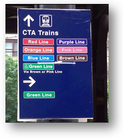
Mounting Materials Can Impact Usability: Careful planning is ideal, but sometimes it’s necessary to put up a temporary sign for a quick fix. One interesting sign highlighted the importance of taking into account the placement of temporary mounting materials. In the image below, the white cable tie that is used to secure the sign to the pole is placed in the middle, dividing information about Green Line trains (as well as the rightward-facing arrow), from information about all other trains (as well as the forward-facing arrow). Thus, users thought it indicated that all Green Line riders—including those in wheelchairs—should turn right. Ultimately, the mounting material used for this temporary sign may have resulted in unfortunate consequences—in this case, with frustrated wheelchair users arriving at a station that is not accessible to them.
Ensure Visibility In Low Light: While most signs were strategically placed in well-lit environments, the reality is that even the strongest lightbulbs inevitably burn out. Our field test really highlighted the importance of planning for this eventuality by using high-contrast colors and reflective paint, which the RTA had already included in its sign designs to ensure that they could be read all lighting conditions.
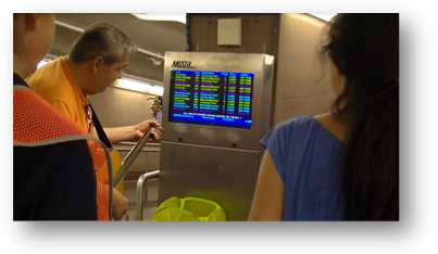
Consider Real-World Distractions: We often forget that the natural environment includes other humans, whose behavior is out of our control. So, it’s no surprise that in train stations, we found that loud talking and noise sometimes made it difficult for our riders to concentrate. The impact of a distracting street musician on the ability to cognitively process a sign or map is something that you can only really understand and plan for if you do testing out in the real world!
Designing for optimal usability includes being aware of the environment in which the design will be placed—as well as how this environment can change. The testing we did for the RTA highlighted how essential it is to consider the visual and auditory elements in the environment when designing an easy-to-use wayfinding experience. Though lab testing is often more comfortable and controllable, nothing beats the insights you can get from seeing an experience happen in the environment for which it’s designed!
If you would like to know more, check out the case study page for additional detail on the research and design work we did for this project.


